A little character.
A clear system.
The DLVX identity: bold lettering, rounded type, warm charcoal and one deliberate accent. The same rules, from a navigation bar to a whole website.
Logo approved. Two type and accent directions to compare.

Cream + rust Bricolage Grotesque + DM Sans
The wordmark leads.
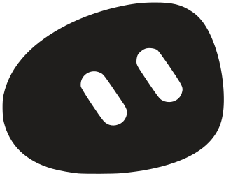
The bot says hello.
Use the original geometric artwork. Its letter shapes stay fixed: the rounded v, the open x, and the same dlvx in both wordmarks.

Quiet in navigation
workcontact22px high on desktop, 20px on mobile. Wordmark only. Leave at least one letter-stem width around it. Never squeeze the letters or add the bot.
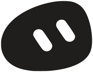
A signature, used sparingly
One purposeful appearance per page: a closing hello, a helpful state, or a social avatar. Keep the silhouette and eyes together. Never repeat it as a decorative pattern.
Minimum wordmark width: 88px. Use the supplied SVGs, in charcoal or white. No alternate font, shadows, outlines or extra logo weights.
Paper. Charcoal. Cobalt.
Warm paper, charcoal and one focused rust accent. Color has a job: it directs attention. It does not need to fill every surface.
Neutrals carry the page. Charcoal carries the message. The accent marks the next action. Avoid stacking several colored sections.
Readable by design
14.30:1 · AA
5.62:1 · AA
5.18:1 · AA
Success #276749 and error #A52B39 are reserved for feedback. Always add words or an icon. The brand accent alone never means success or failure.
Character, kept quiet.
Bricolage Grotesque brings more expressive headline shapes. DM Sans keeps the text around them calm and easy to read. Two families, clearly assigned.
Brand, software
& intelligence.
Good work.
Built to stay useful.
We build the production layer behind sharp brands: websites, apps, automations and AI workflows that stay useful after launch.
DM Sans 600 · navigation, buttons, captions
Use sentence case. Body text stays at least 16px; labels at least 12px. Keep headlines balanced and avoid a lone last word. Fonts are self-hosted, with system fallbacks.
Everything belongs
to the same family.
Soft corners echo the lettering. A clear hierarchy tells people what matters. The size of a control follows the hand, not the amount of text.
Actions
One primary action per decision. Give secondary actions quieter emphasis.
Forms and feedback
Visible labels, useful hints and a specific next step. Errors sit beside the field they belong to.
Use the address where you want the reply.
Geometry and icons
10px control corners. 12px image corners. 44px minimum targets. Space in steps of 8px, with 4px for fine alignment.
Simple stroke icons, 20px with a 1.75px stroke. No emoji standing in for interface controls.
Let the work
be the interesting bit.
Real screens, real places and real people. Preserve the client’s colors inside project images. Keep captions outside the image, where they can breathe.
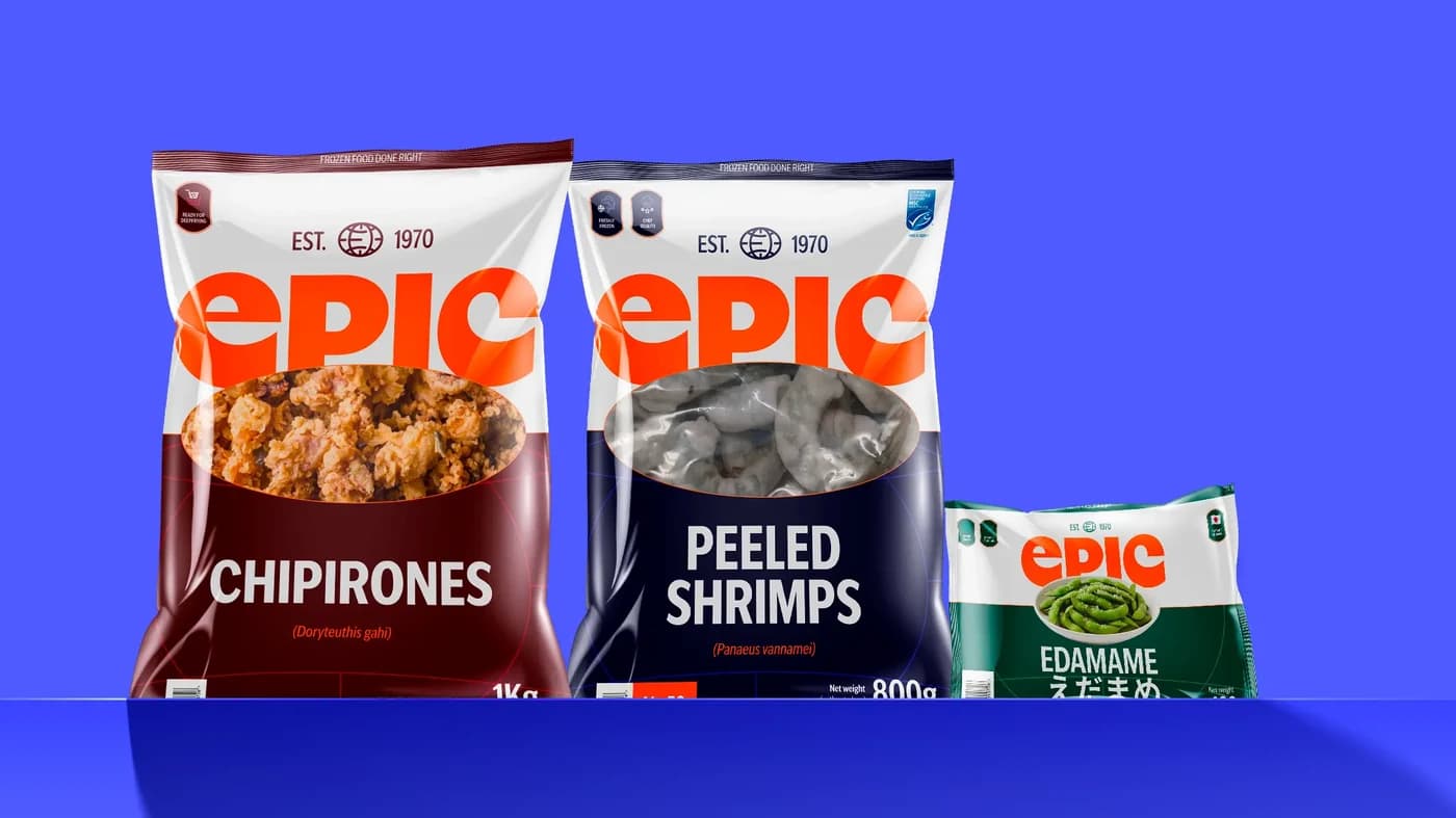
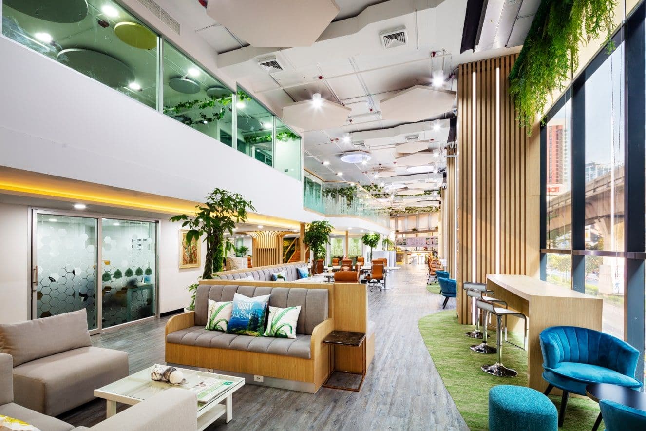
No fabricated dashboards, stock teams, decorative AI imagery or dark overlays behind text. Existing Notes illustrations are editorial archive assets, not a rule for new brand colors.
Responsive.
In every sense.
Fast, clear feedback makes the brand feel considered. Movement follows an action and leaves the content readable.
Motion
220ms, easing gently to rest. Hover changes color; arrows move a little. Content is visible from the start. Respect reduced motion and provide controls for video.
Small screens
Stack by reading order. Keep real gutters and full-size tap targets. Images keep a useful crop. Never shrink an entire desktop composition to fit.
Voice
Plain, direct, specific. Say what we build and what happens next. Use real project proof. Let personality live in the details, not in inflated claims.
One source.
Ready to use.
This page and the homepage previews use the same color and geometry definitions. The approved logo and type are fixed; the palette choice stays visible until it is settled.


Brand system 2026.09. Bricolage Grotesque + DM Sans. Original-01 logo artwork, approved by Wil. The homepage type and accent choice is being settled on the previews.