Brand, software, and AI.
+ brand systemv1 · 2026built with itself
The system, in public.
This is how we build. Type, color, the mark, buttons, image rules, and the two modes we work in. Every block on this page is rendered from the same tokens a DLVX project ships with. No UI kit, no icon library, no stock. The brand is the build.
One wordmark. Approved.
The mark is dlvx.co set in Fraunces 800 lowercase, tracking -0.04em, with the registered glyph superscripted top right. It lives in ink on paper, or paper on ink. We do not stretch it, recolor it outside these fields, or invent alternate weights.
Clearspace. Keep a margin of at least one cap height of the mark on every side. Nothing crowds it, nothing overlaps it, and it never sits on a busy photo or a gradient.
Three families. One voice.
Fraunces for headlines, Inter Tight for everything you read, and JetBrains Mono for eyebrows, receipts, and code. Self hosted with next/font, so the swap is invisible. These are live specimens, not screenshots.
Published prices. You own the repo.
We build websites, apps, website rescue, SEO and GEO, and ERP bridges from Brussels and Bangkok. One brief, one price, live in days.
Body copy runs at 16px on a 1.55 line. Long enough to read a full case study without fatigue, tight enough to keep a landing page honest. Weights 400, 500, and 600 cover everything from paragraphs to emphasis.
+ 004 · full-stack · brussels & bangkok · since 2021
Paper, ink, one accent.
A warm paper canvas, ink for text, and a single acid accent that earns its place only on a call to action. Green and red carry state, pass and fail, nothing more. Tap any swatch to copy the hex.
surfaces
ink
accent and state
Two registers, live.
Pills carry the marketing surface: soft radius, Inter Tight, generous padding. Operator controls carry the dashboards and internal tools: square, mono, uppercase. Every button here is a real class from globals.css, rendered live.
+ pills · marketing · 15px / 500 / pad 14×22 / radius 10
acid = one CTA per screen. never two.
+ operator controls · internal · mono 11px / uppercase / radius 2
square, quiet, and dense. built for people who live in the tool.
Real work, quiet frames.
We show real project photography and real screens in calm, cropped frames. No stock people, no fabricated UI, no gradients over text, no AI gloss. If a frame needs a scrim to be readable, the frame is wrong, not the text.
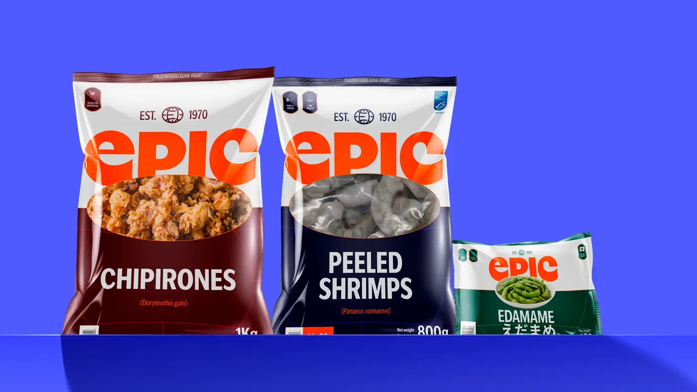
Do. A real client screen, cropped clean, sitting on its own. The frame does the work.
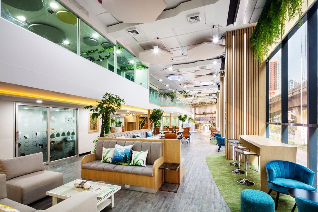
Do. Real, quiet photography of our own space. No people posed for a camera that was never there.
 Headline on a scrim
Do not. A dark gradient scrim and a glossy sheen dropped over the photo to force text on. We never do this.
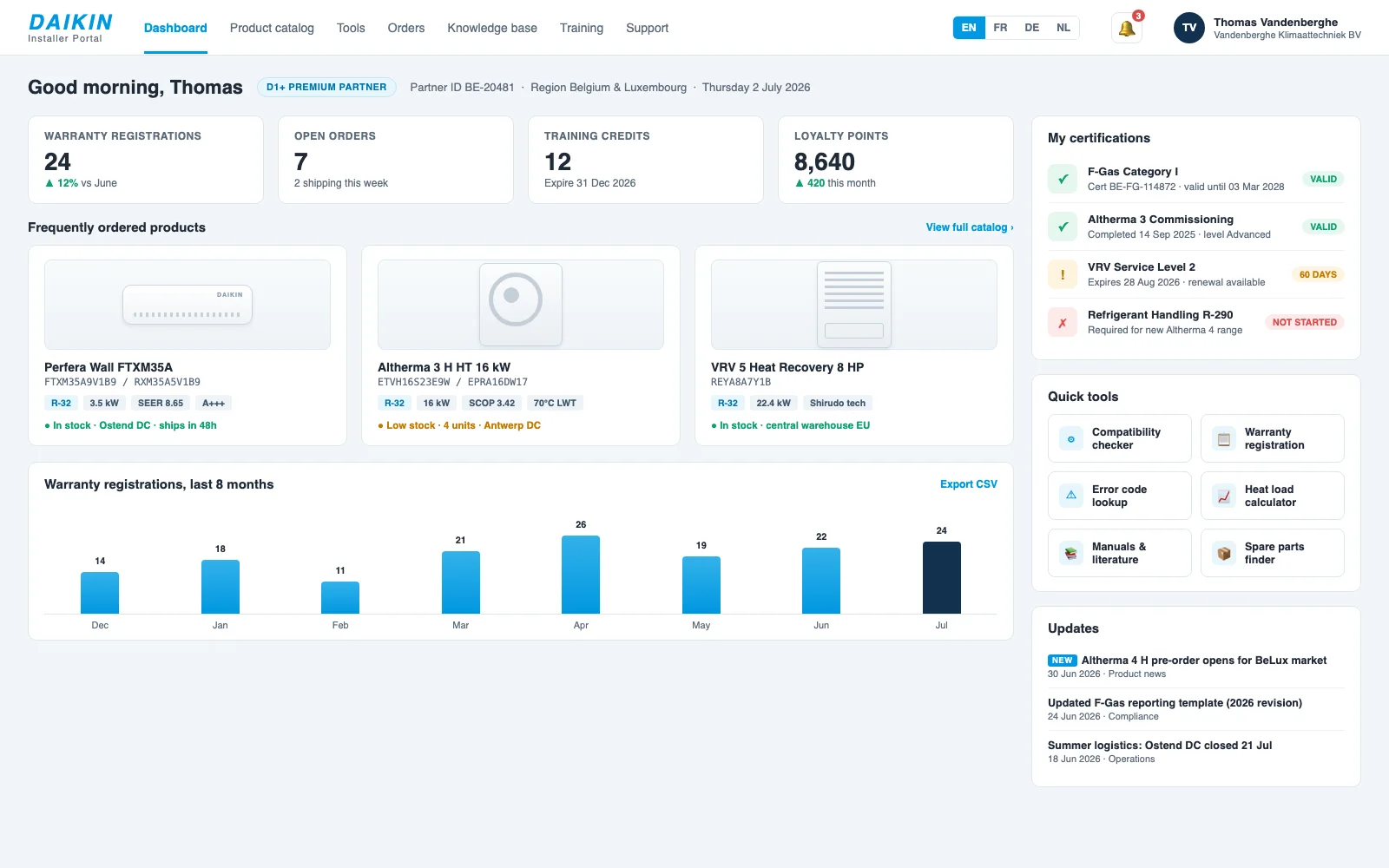
Do. Caption sits below the frame, in ink on paper, where it is always readable.
Marks, not an icon set.
We do not ship an icon library. The visual shorthand is a small set of typographic marks set in JetBrains Mono, plus the odd hand-drawn glyph when a mark truly needs a shape. Quiet, consistent, and weightless on the page.
Two modes we build in.
Studio Proof is the default: paper, ink, warm grey, with the acid accent used once. Notes is the writing surface: lemon field, black ink, and the yellow cartoon covers that live only there. Same type, same voice, two temperatures.
+ studio proof · default
propick · live
A property portal that closes the loop.
We rebuilt the search, the intake, and the follow up so a lead never falls through. Shipped, indexed, and handed over with the repo.
106google clicks / month, up from 44
+ notes · writing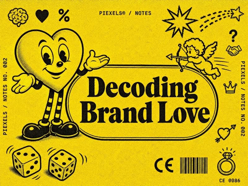 notes · 004
A website is not a lead system.
6 min read →The short version.
If a decision is not covered above, these settle it. When a draft breaks one of them, it does not ship.
do
- Build from the tokens on this page, never a parallel palette.
- Keep the acid accent to one call to action per screen.
- Set headlines in Fraunces, read text in Inter Tight, labels in mono.
- Show real work in clean, cropped frames with the caption below.
- Write in a customer-facing we, plain and specific.
do not
- Put bars, scrims, or gradients behind text on a photo.
- Use stock people, fabricated UI, or AI-glossed images.
- Wallpaper the acid yellow or use it as a background.
- Put the yellow cartoon covers anywhere but Notes.
- Use em or en dashes, or invent alternate logo weights.
+ end of system · v1 · 2026 · built with itself